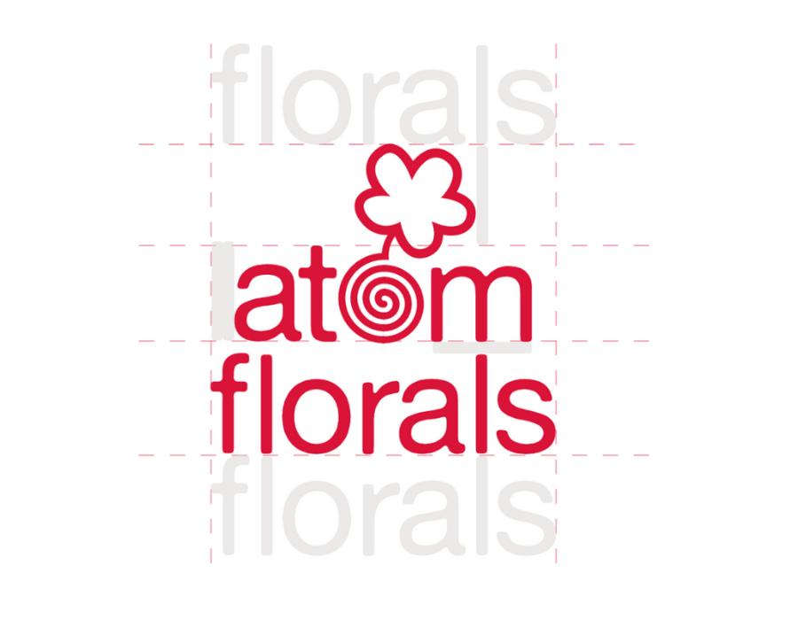
Full Color Lockup
Atom Florals is a brand built on nostalgia, whimsy, and daily joy. This logo was created for a conceptual floral design studio, and this lockup reflects its quiet philosophy. The atom symbol expands into a circular vessel that houses the flower and naturally becomes the “o” in atom, tying the science-inspired motif back to the organic beauty of florals.
Phase 1: Gathering Inspiration
In the initial phase, I gather a chaotic amount of photography to build a visual dictionary for myself to begin building the brand. These are the building blocks. I wanted Atom Florals to feel ephemeral, feminine, and to spark joy, mirroring the respected Japanese practice of Ikebana.
Phase 2: Ideation
This is where ideas flow on the page. With my visual dictionary in mind, I create as many iterations as possible, experimenting with different styles and moods, all whilst keeping my brand vision in align.
Phase 3: Black and White Logo
Designing in black and white first, as a universal design practice, allows me to see the logo as a pure concept. It's the ultimate stress test. If it fails in black and white, it fails in regular practice.

Experimenting with adding "floral studio" to the full logo

Experimenting with photography use
Phase 4: Color
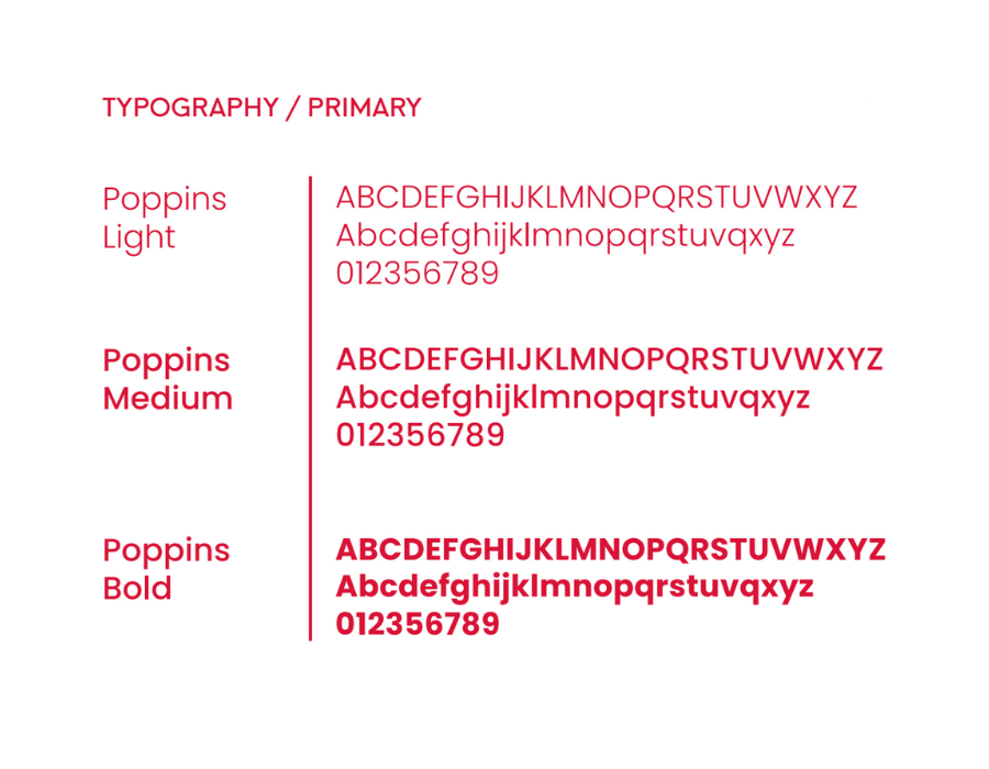
After deciding on a color palette and primary and secondary fonts that reflects my brand identity, I begin to add more to my logo suite, including a wordmark, primary logo, secondary logo. Each logo is measured using relative and absolute measurements to ensure readability, cohesion, and accuracy.


